benharri.github.ioA minimalist design exploration |
Version | v0.1.0 | |
|---|---|---|---|
| Updated | |||
| Author | Ben Harris | License | MIT |
i wanted to put something on my github page and was inspired by https://owickstrom.github.io/the-monospace-web/.
probably won’t put much else here. check my main site for the rest.
Monospace fonts are dear to many of us. Some find them more readable, consistent, and beautiful, than their proportional alternatives. Maybe we’re just brainwashed from spending years in terminals? Or are we hopelessly nostalgic? I’m not sure. But I like them, and that’s why I started experimenting with all-monospace Web.
On this page, I use a monospace grid to align text and draw diagrams. It’s generated from a simple Markdown document (using Pandoc), and the CSS and a tiny bit of Javascript renders it on the grid. The page is responsive, shrinking in character-sized steps. Standard elements should just work, at least that’s the goal. It’s semantic HTML, rendered as if we were back in the 70s.
All right, but is this even a good idea? It’s a technical and creative challenge and I like the aestethic. If you’d like to use it, feel free to fork or copy the bits you need, respecting the license. I might update it over time with improvements and support for more standard elements.
This document uses a few extra classes here and there, but mostly it’s just markup. This, for instance, is a regular paragraph.
Look at this horizontal break:
Lovely. We can hide stuff in the <details>
element:
Hidden gems.
This is a plain old bulleted list:
Ordered lists look pretty much as you’d expect:
It’s nice to visualize trees. This is a regular unordered list with a
tree class:
/dev/nvme0n1p2
We can use regular tables that automatically adjust to the monospace grid. They’re responsive.
| Name | Dimensions | Position |
|---|---|---|
| Boboli Obelisk | 1.41m × 1.41m × 4.87m | 43°45’50.78”N 11°15’3.34”E |
| Pyramid of Khafre | 215.25m × 215.25m × 136.4m | 29°58’34”N 31°07’51”E |
Note that only one column is allowed to grow.
Here are some buttons:
And inputs:
Add the grid class to a container to divide up the
horizontal space evenly for the cells. Note that it maintains the
monospace, so the total width might not be 100%. Here are six grids with
increasing cell count:
If we want one cell to fill the remainder, we set
flex-grow: 1; for that particular cell.
We can draw in <pre> tags using box-drawing
characters:
╭─────────────────╮
│ MONOSPACE ROCKS │
╰─────────────────╯
To have it stand out a bit more, we can wrap it in a
<figure> tag, and why not also add a
<figcaption>.
┌───────┐ ┌───────┐ ┌───────┐
│Actor 1│ │Actor 2│ │Actor 3│
└───┬───┘ └───┬───┘ └───┬───┘
    │         │         │
    │         │  msg 1  │
    │         │────────►│
    │         │         │
    │  msg 2  │         │
    │────────►│         │
┌───┴───┐ ┌───┴───┐ ┌───┴───┐
│Actor 1│ │Actor 2│ │Actor 3│
└───────┘ └───────┘ └───────┘
Let’s go wild and draw a chart!
                      Things I Have

    │                                     ████ Usable
15  │
    │                                     ░░░░ Broken
    │
12  │             ░
    │             ░
    │   ░         ░
 9  │   ░         ░
    │   ░         ░
    │   ░         ░                    ░
 6  │   █         ░         ░          ░
    │   █         ░         ░          ░
    │   █         ░         █          ░
 3  │   █         █         █          ░
    │   █         █         █          ░
    │   █         █         █          ░
 0  └───▀─────────▀─────────▀──────────▀─────────────
      Socks     Jeans     Shirts   USB Drives
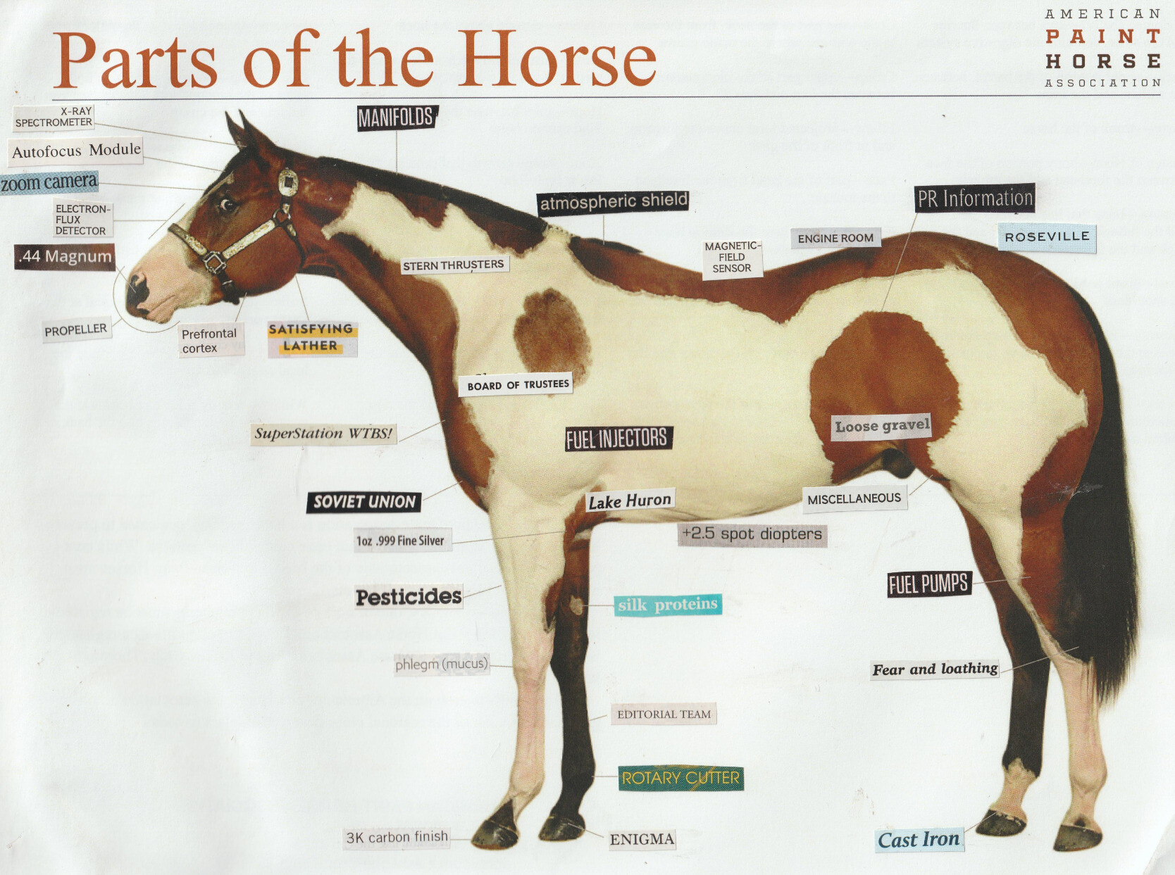
Media objects are supported, like images and video:

They extend to the width of the page, and add appropriate padding in the bottom to maintain the monospace grid.
That’s it for now. I’ve very much enjoyed making this, pushing my CSS chops and having a lot of fun with the design. If you like it or even decide to use it, please let me know.
The full source code is here: github.com/owickstrom/the-monospace-web
Finally, a massive shout-out to U.S. Graphics Company for all the inspiration.